See also: spreadsheet analysis template that accompanies this resource.
Sales incentive compensation programs require periodic calibration to ensure an uninterrupted positive return on investment for management. Many firms wait for the first signs of a sales compensation problem to appear before examining their program’s health. But by then, problems may have already developed into a needlessly expensive quagmire.
A better approach: conducting “wellness checks” of the incentive compensation program through routine, data-driven diagnostic analyses. In this article, five quantitative analyses of pay plan performance are reviewed. Also included are spreadsheet-based modeling tools that can serve as templates for your own sales compensation program analysis.
These analyses help answer the question: “How do we measure sales incentive compensation plan effectiveness?” Their use — and the use of other diagnostic analyses – should underpin management’s efforts to periodically evaluate their sales pay programs. The Sales Management Association recommends annual incentive compensation plan effectiveness reviews.
Analysis 1: Earnings Distributions
The difference in earnings between a top performer in the sales force and a mid-level performer should be significant enough to inspire efforts to get to the top. Some plans that are designed with this goal in mind do not deliver on the promise. To begin to understand whether an incentive plan is effectively distributing pay, begin the annual check up with an analysis of earnings distribution.
Analyzing earnings distribution across a population of sales representatives reveals the degree of earnings variation that exists within the sales force. Earnings distributions are efficiently displayed using histograms: a columnar chart which tabulates frequencies, or occurrences, on individuals’ earnings within specified ranges, or bins.
What earnings distribution analysis tells management:
Earnings distributions show how uniformly earnings are dispersed across the sales force population analyzed. Of particular importance to management is the shape of the distribution, or “curve:” a bell-shaped, or normal, distribution indicates that any given earnings amount is less likely to occur the farther away that amount is from population’s median earnings. The particular shape of the distribution curve reveals much about compensation plan impact on the sales force, and may reveal some bias in the plan which its designers did not intend.
Earnings distributions most often show earnings in one of two forms: (a) cash compensation (either total cash compensation or incentive compensation); or (b) earnings as a percentage of targeted compensation. Generally speaking, a distribution curve with bell-shaped characteristics — that is, a curve with one hump near the middle — is preferable. Such a distribution curve shape indicates an even distribution of earnings above and below the population’s median value. For groups of sales representatives in roughly equivalent positions, management typically expects this pattern of income dispersion. Curves that are not bell-shaped typically signal a problem with earnings patterns within the sales force.
The Sales Management Association’s Spreadsheet Charting Template
The Sales Management Association has developed a charting template to accompany this Research Brief. Use the template to duplicate the analyses you see here with your own data. Members may access the template online here.
Common earnings distribution curves and management’s interpretation in quantifying sales compensation plan effectiveness
 |
 |
 |
 |
 |
Figure 1. Sample Analysis: Sales Force Earnings Distribution

Earnings Distribution “How-To”
- Define measurement criteria. Two suggested measurements: total incentive dollars earned, or total actual compensation as a percentage of total target compensation.
- Secure data for the population you wish to analyze. For best results, include only those current sales representatives in similar positions, and exclude “rookies.” Their performance will distort results, and should be considered separately.
- Determine the range of the data by subtracting the smallest value from the largest and designate it as R. Example: Largest value: $95,000; Smallest value: $25,000; R = $95,000 – $25,000 = $70,000.
- Determine the number of bins and the bin width. The number of bins, k, should be no lower than six and no higher than 15 for practical purposes. Use trial and error to achieve the best distribution. In the example above, k=9.
- Determine the bin width (H) by dividing the range, R, by the preferred number of bins, k. Example: R/k = $70,000/7 = $10,000.
- Establish the bin midpoints and bin limits. The first bin midpoint should be located near the largest value, using a convenient increment. Bin widths should be equally sized. I suggest using an odd-number of bins, with the middle bin corresponding to target compensation.
- Determine graph axes. The frequency scale on the vertical axis should be slightly larger than the largest column, or bin frequency. The measurement scale along the horizontal axis should be at regular intervals.
The “spread” or width of a performance distribution refers to the difference between the lowest and highest values. For example, a distribution may range from 60% of quota to 200%; or it may go from 90% to 115%. That width tends to vary with market maturity and data accuracy. However, between the high and low values, analysis of the distribution of performance results is highly dependent on goal-setting accuracy, as well as the distribution of sales skills within the sales force. Therefore, performance distribution analysis yields insights as useful to management as those gained from an examination of earnings distributions. It can point to a need for better sales training or manager development.
Depending on how performance is defined and measured within the sales organization, performance distribution analysis can have many variations. Most commonly used are distributions that examine performance based on sales volume, percentage of quota achieved, or percentage sales growth.
What performance distribution analysis tells management:
Like earnings distributions, performance distributions illustrate performance variations across the population examined. Management hopes to see a bell-shaped, or approximately symmetrical distribution of performance around the median performance value. For sales forces utilizing quota-based performance management, the distribution curve’s orientation to 100% of quota achievement is particularly important.
Figure 2(a). Sample Analysis: Sales Force Performance Distribution – Bell-Shaped:


|
Shape of the Performance
Distribution Curve |
What it Tells Management |
| A normal or approximately symmetrical distribution. A bell-shaped curve with the most frequently-observed value in the center, and less-frequently observed values tapering at either end. | Symmetrical performance distributions indicate accuracy in sales force objective setting, assuming the distribution curve’s median value is closely aligned with 100% of quota achieved. |
| Skewed distribution. A bell-shaped curve, but with values tapering to one side or the other. | Indicates an over-weighted presence of high or low performers. This may be appropriate, given economic, market, or firm conditions; but may also indicate a misallocation of sales force goals to quota-bearing sellers. |
| Comb Distribution. Also called a saw-tooth distribution, it features an alternating, jagged pattern of occurrences above and below the median value. | Shows little relation between individual performance and assigned goals — a clear indication of quotas that are not relevant to market or job conditions. |
| Bi-Modal Distribution. A distribution with two humps, often clustered well above or below the median value. | Suggests two distinct populations of high performers and low performers. If these two populations exist both above and below 100% of quota achievement, this distribution also highlights quota-setting inaccuracy. |
| Cliff Distribution. Values diminish abruptly at one end of the distribution curve. | Suggests bottlenecks in sales capacity, as sellers find it difficult to break through into higher performance levels. |
Analysis 3: Pay and Performance Scatter Plots
Tying pay (reward) to performance (results) is a critical goal for sales incentive plans in general. Sales leaders and finance executives share this concern. One particularly effective analysis to study the pay/performance relationship is the scatter plot.
Pay and performance scatter plots use Cartesian coordinates to display values for sales representatives’ performance and compensation. In this analysis, performance is typically considered an independent variable, and is plotted on the horizontal, or x-axis. Pay, which for sales representatives is (presumably) dependent upon performance, is considered a dependent variable and plotted on the vertical, or y-axis.
What pay and performance scatter plot analysis tells management:
Plotting these two values in this fashion often provides visually compelling evidence of the link — or disconnect — between pay and performance. In statistics parlance, this relationship is referred to as correlation.
The savvy analyst will carefully choose among various metrics for “performance” and “pay,” to gain the most useful insights from the analysis:
Examples of performance metrics include:
-
Quota achievement for one measure. Using quota achievement levels the field between large and small territories. If the measure chosen is a revenue or other financial measure in the plan, you can determine if the sellers who best penetrate their market opportunity are earning the richest rewards.
-
Combined quota achievement for all measures. By using a weighted average of results, it is possible to create a blended performance metric useful when balanced selling is a desirable outcome.
-
Revenue or gross margin produced. Rather than look at quota, some analysts prefer to look directly at production. This can be useful, but must be considered in the light of territory assignments, not just sales production.
Pay metrics include:
-
Incentives earned for a single measure in the plan. This is useful when there is a dominant and/or mission critical measure in the plan.
-
Total incentive earnings. This goes best with combined quota achievement, although it could be used to test whether high earners are missing key goals.
-
Total Cash Compensation. Using salary plus incentive can be instructive, particularly in a highly tenured and low-mix sales force. On the other hand, if all sales people earn the same salary, then including it dilutes the correlation.
Generally speaking, management looks for strong, positive correlation between pay and performance. Positive correlation exists when the pattern of plotted points moves from the scatter plot’s lower left quadrant to its upper-right. Correlation can be further illustrated by inserting a line of best fit within the plotted points. Correlation is measured using a best-fit procedure called linear regression, and a sum of squared residuals measurement referred to as “r2.” A complete discussion of regression analysis is far beyond the scope of this article, though for the journeyman statistician it’s important to note that an r2 value of 1 represents perfect correlation, an r2 equal to 0.0 indicates perfect randomness.
Figures 3(a) and 3(b). Sample Analysis: Sales Force Pay and Performance Scatter Plots


Management uses scatter plot analysis to discern more than pay and performance correlation. Of particular importance may be outlying data-points that represent unforeseen variation from the incentive compensation program’s intended design. Also relevant may be clustering of data points around pay and performance tiers. Scatter plots may sometimes indicate unique job classifications or roles among a population of sellers previously considered to be part of a homogeneous job classification.
1. Define pay and performance measurement criteria. Suggestions:
Pay
|
Performance
|
The performance criteria selected should, at minimum, relate to the incentive compensation plan’s performance measures (i.e., those used in determining payouts).
- Secure pay and performance data for each incumbent, based on selections above. Limit scatter plot analysis to a single population served by one unique incentive compensation plan.
- I recommend Microsoft Excel’s charting function for creating scatter-plots. Depending on your installation of Excel, this may require installation of an “Analysis Tool Pack.”
- You may consider removing outlying data points from the data set. While such outliers are sometimes instructive, they may also be non-representative of the general population (e.g., because of a special “one-off” pay program for a unique individual).
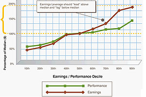
Analysis 4: Earnings Leverage Trend
Providing significant upside for top performers as you observe the constraints of the sales compensation budget requires paying attention to both ends of the performance and pay scales. The earnings leverage analysis can also help justify the cost of sale if combined with Analysis 5, the Compensation Expense Analysis.
Earnings leverage trend analysis also compares pay and performance within a population of sales representatives. It shows a cumulative distribution of earnings at each decile, displayed as a percentage of median pay; and the corresponding cumulative distribution of performance, also displayed as a percentage of median, for the same population.
What earnings leverage trend analysis tells management:
These two sets of values are displayed as overlapping trend lines; their relationship to each quantifies important aspects of the pay program’s risk and reward offered to sales representatives.
Well-designed sales compensation plans offer richer earning opportunities for performance that exceeds expectation; in return, management places “at risk” a portion of the sales representative’s total target compensation. In an earnings leverage trend analysis, this relationship is reflected in an earnings line which exceeds performance at higher performance deciles, and which trails the performance line at the lower deciles. Without sufficient separation in the two trend lines, the pay plan may not be creating enough income difference between high and low performers.
Figure 4. Sample Analysis: Sales Force Earnings Leverage Trend

- Define measurement criteria. The pay trend line should track either incentive compensation earnings, or total compensation. For plans with high base salaries as a percentage of target total compensation, or where there is little variation in bases salaries, limiting the pay line to incentive earnings may provide the greatest insight. For the performance line, use predominate performance measure present in the incentive compensation plan. Typical examples include: sales volume attained, percentage of sales or profit quota achieved, or percentage sales growth.
- Secure data for population you wish to analyze. For best results, include only those incumbent sales representatives in similar positions, and exclude “rookies:” their performance will distort results, and should be considered separately. The Microsoft Excel template accompanying this article automates steps 3-5 below.
- Calculate the median values for incumbents’ pay and performance data.
- Determine the percentage of median for each unique pay and performance value.
- Select the values for each performance decile for use in plotting trend lines.
- Plot decile pay and performance in two lines.
Analysis 5: Compensation Expense Analysis
For many firms, sales compensation is the predominant component of SG&A. Since sales compensation frequently has a complex relationship with other aspects of the P&L statement, managers must often review multiple metrics in order to fully understand sales compensation expense trends. While there is no single analysis that always provides complete compensation cost of sales information, presented here are two separate analyses that frequently prove useful to management.
-
Compensation cost of sales with pay mix by quartile
-
Earnings composition by plan component by quartile
Figure 5(a). Sample Analysis: Compensation Pay Mix by Quartile

These analyses are primarily descriptive; they answer the questions:”What are fixed and variable sales compensation expenses, as a percentage of sales?” and “What are compensation expense trends for each component of the incentive compensation program?” The first shows the distribution of earnings in fixed pay (base salary) and variable pay (incentive compensation) across the sales organization, according to performance quartile. This allows management to understand levels of participation in the incentive compensation program, while also revealing the earnings risk-and-reward landscape among eligible earners.
Figure 5(b). Sample Analysis: Incentive Compensation Earnings by Plan Component and Quartile

The second analysis similarly illustrates sources of incentive compensation within plans that feature multiple opportunities to earn incentive pay. Each pay plan component is illustrated as a percentage of the total earned within each quartile of the sales organization. This analyses provides an at-a-glace understanding of how various pay plan components are contributing to the sales force’s earnings opportunity. Management should then be able to quickly assess whether actual earned incentives are consistent with the pay program’s intended emphasis on various distinct performance metrics.
Conclusion
While by no means an exhaustive list of sales compensation analysis tools, this set of five analyses should provide an excellent foundation for firms interested in a critical assessment of their programs. Proactive analysis — regularly performed — will provide management with solid return on sales compensation investments while avoiding costly and disruptive mid-year plan redesign efforts.
About The Author
Kathy Ledford is a Principal in Buck Consultants’ compensation practice, and focuses on Sales Management Consulting

Ms. Ledford previously served with Sibson as Senior Vice President., and as Principal with The Alexander Group. She has more than 15 years of consulting experience developing and implementing sales effectiveness programs, aligning sales resources with market opportunities, and improving sales productivity. Prior to consulting, Ms. Ledford was Director of Investor Relations for a development stage pharmaceutical company.
Ms. Ledford has spent a large portion of her consulting time working with large multi-line pharmaceutical companies as well as specialty and start-up pharma companies. At Buck, Ms. Ledford focuses on this industry sector nationally while also serving a broad range of business-to-business industries in the southeastern US.
Ms. Ledford received her MBA from the Yale School of Management. She holds a BA from Albion College and a BMSc from Emory University.